EUROPICKS WEBSITE
Client
Premier Polmarex
Role
Full Stack
Year
2023
Deliverables
Web Design & Logo
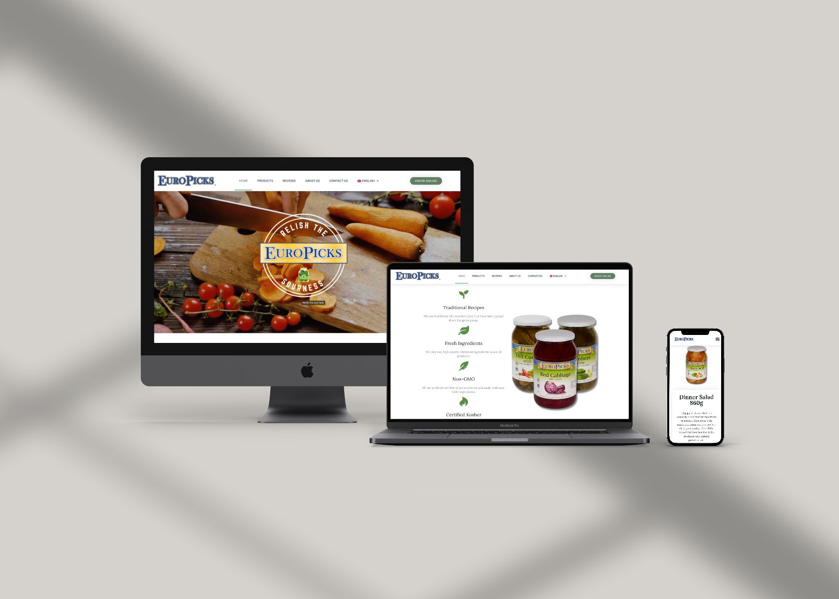
For the EuroPicks.ca project, I had the opportunity to work on a brand that showcases traditional European vegetable-based recipes in the Canadian retail market. As a Canadian-owned brand, EuroPicks has gained immense popularity as a household pantry favorite throughout the country. From their delicious pickled peppers to cucumbers and mushrooms, EuroPicks offers a diverse range of products that bring the authentic flavors of Europe to Canadian consumers.
Design
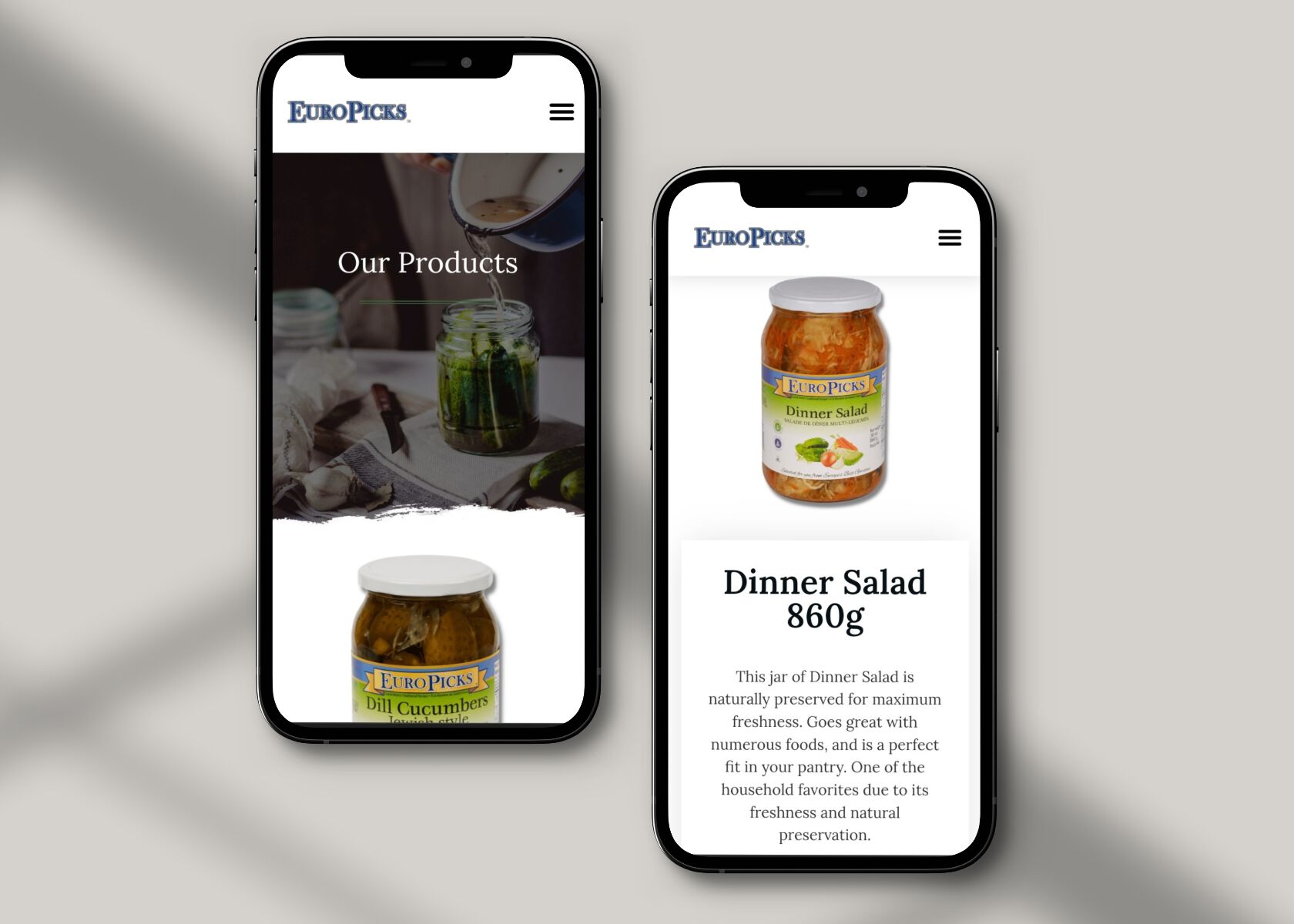
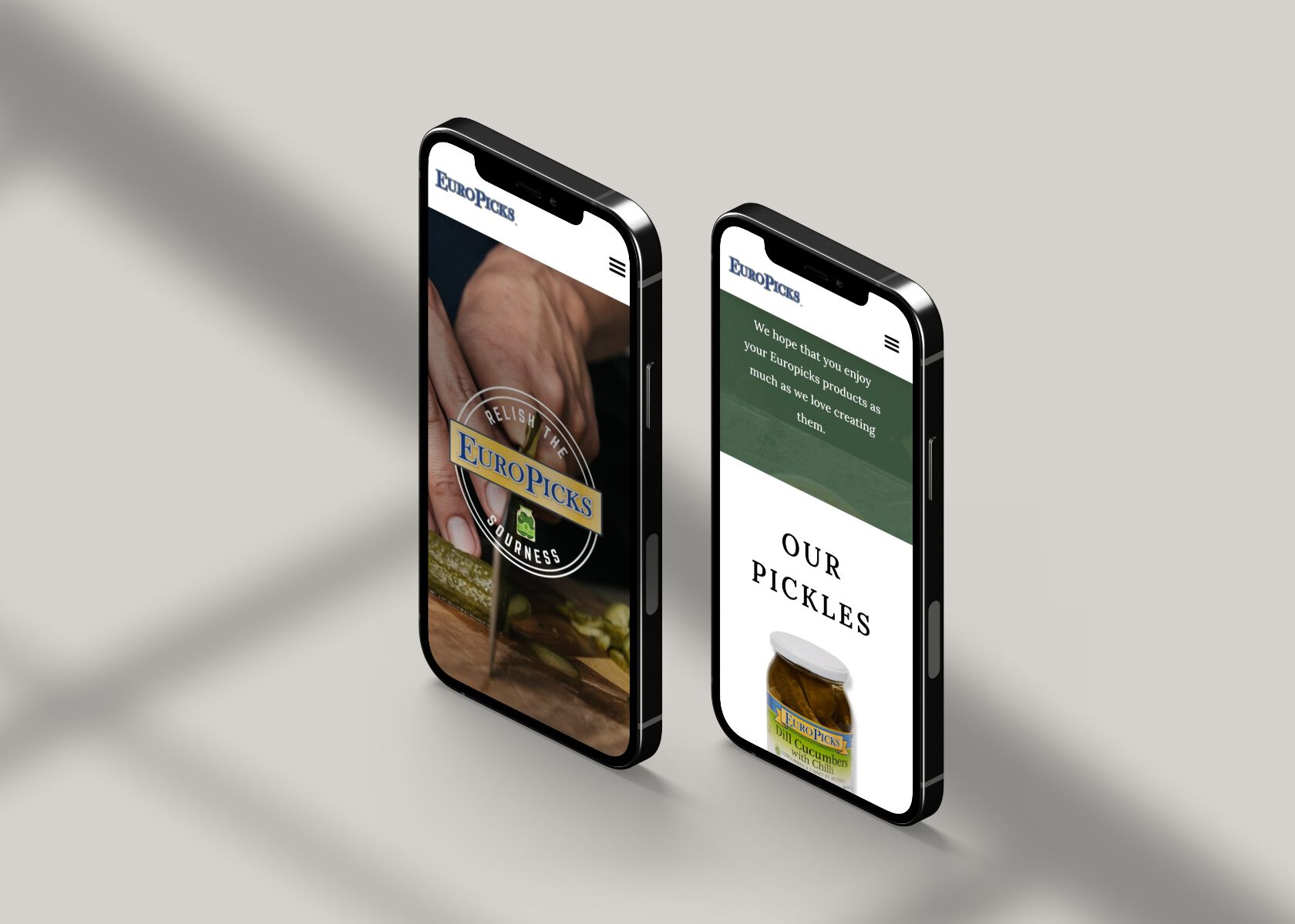
In terms of design, I aimed to create a website that reflects the brand's commitment to nature-inspired flavors and quality. Drawing inspiration from the lush colors of nature, I incorporated a color palette that seamlessly blended with the EuroPicks brand logo and overall aesthetics. Green was chosen as the primary color, symbolizing freshness, vitality, and the organic essence of the products. By utilizing nature-inspired colors, the website evokes a sense of connection with the authentic ingredients and traditional European recipes that EuroPicks represents. The design of EuroPicks.ca focuses on creating a visually appealing and user-friendly experience for visitors. The website layout and navigation were carefully crafted to ensure easy access to product information, recipes, and the online store. A clean and intuitive interface allows users to seamlessly explore the range of EuroPicks products, browse recipe ideas, and make purchases with convenience.


